Showing posts with label copper. Show all posts

August 30, 2011

Review: Linnaeus Cosmetics - Axolotl Collection


So recently I found out I won a giveaway over at Toxid Lotus for Linnaeus Cosmetics' Axolotl collection. I was beyond ecstatic because I've been wanting to give Linnaeus a try and also two out of the three colors are ones that I don't have anything even remotely similar in my collection. I had originally shied away from pinks but as you'll see soon, I love these.

Unfortunately, I was a dolt and forgot to take pictures of the packaging but it was simple and something that I would expect from a company that uses wildlife as inspiration. It came in a canvas drawstring pouch with a rabbit stamped on it. It was also tied with natural raffia and had a little MOO card with all of the company info on it. I detached the raffia and put the card on the drawstring so that when I show it off, the information is right there.

From L to R in natural light: Puerile, Branchial, Archetypal
Puerile - This is the lightest of the colors. The website says:

The name of this eyeshadow references the perpetual immature state of the Axolotl; they do not developmentally advance as far as most salamanders. Puerile is a delicate, pink rose shade. It has a hint of a warm yellow-toned background that is overlain flecks of white and pink.

Puerile is a shade that is sheer and light. The main shade that is great to wear alone for everyday or pair it with one of the other colors for a little more depth. It also makes a wonderful highlight color. I agree that it has a bit more of a yellow undertone which is why it goes great with both the cooler Branchial as well as the warmer Archetypal. The formulation is very smooth and light which surprised me in a good way. I had very little fall out over Too Faced Shadow Insurance as well.

L to R with Flash: Puerile, Branchial, Archetypal
Branchial -

“Branchial” is used to describe the gill filaments in vertebrate anatomy. This became the name of this particular eyeshadow because Axolotls keeps their gills their entire life, unlike other salamanders. Branchial leans a bit toward a brick red; it has orange undertones to it. It has a cardinal red shimmer with flecks of deep pink sparkle throughout.

This description was a smidge off to me. Especially when placed next to Archetypal Branchial seems to be on the cooler side of the spectrum. The photos on Linnaeus' website were very true to what I received though which surprised me. For a moment, I thought this description was for Archetypal and I had to double check. Despite this, I like using this color on the top half of my lid over Puerile. It deepens it just a little bit and works as a great in-between color for when I am layering all three. Yet again, a smooth application with little fall out.

Archetypal -

Archetypal is a maroon based red with a gorgeous, subtle sheen. There are glints of dark and light pink dusted over top. This shade was coined Archetypal due to the fact that unfortunately, Axolotls are excellent model organisms in research. This means that they are ideal to study because among other reasons, they have a relatively well understood development pattern and also have the ability to regenerate limbs.

Hmmm... I'm not sure I would have picked out maroon as the base for this. It looks a lot more toward the coral/copper end of the spectrum and actually seems to be a great dupe for the sample of Rockeresque Beauty's Beating Heart which isn't available yet. It's warm, orange-y, and full of glitter. This was the color that I had the most issues with fall out. This wasn't necessarily because of the amount of shadow that ended up on my cheek so much as what little did end up there made my cheek turn copper. Just something to be aware of and keep some makeup remover handy and do this before you apply blush to your cheeks.

Overall, still a very squee worthy set. With the light formulation and sheer, glittery colors this is something that stands apart from most of the other indie products I've tried. Definitely worth taking a look at and I love the inspiration behind the collections. A lot of these colors could possibly be found elsewhere but on the same token if you enjoy conservation and wildlife, these are for you.

August 24, 2011

Review: Geek Chic Cosmetics - Win or Die (6 out of 8 colors)

Disclosure: The two full size colors I am reviewing were bought for me as a gift by a friend with no affiliation with Geek Chic Cosmetics. The four samples I am reviewing were a prize from winning fan favorite in GCC's Look of the Day contest.


Oh A Song of Ice and Fire, what a history you and I have. Not to say this is a bad thing but some friends of mine have been trying to get me to read the books for about six years. Little did they know all it would take to get me hooked was a single episode with an all-star cast. As soon as I realized Geek Chic Cosmetics was coming out with a Game of Thrones inspired set, I knew most of them had to be mine.

Win or Die, the new set, contains mostly colors with a shimmer and I'm not complaining at all. I tend to wear glittery and shimmery eye shadows regardless so this set is right up my alley in that respect. The colors I received were Across the Narrow Sea, Born in Fire, The Imp, The Pointy End, and Kingslayer. Two full size and four samples respectively.

Since I owe you some Geek Chic swatches from my previous purchase, I have included some that are in similar color families for comparison.
A lush, rich turquoise as deep as the sea at the end of the world. More green than blue, with gleaming seafoam highlight and a glimmer of aqua sparkles. Goes on opaqaue and smooth for even coverage. Can be used wet as an eyeliner. Not lip safe.
I think they got this description spot on. The color does go on opaque and smooth and it only took one or two swipes to get a good, solid color even without primer. I don't own any other turquoise colors like this so I was eager to try it out and I'm very pleased. I can see myself using it for LARP or even for an evening look.

With Flash
In Natural Light


Other than the inspiration, this color makes me think of mermaids, sirens, and other sea creatures of myth and fantasy.

The rich, regal violet of the Targaryens with smokey indigo depths. Silky, with a pearlescent sheen and a scattering of glittering ruby embers. Born in Fire goes on opaque makes for a smoldering smoky eye. It can also be used wet as an eyeliner. Not lip safe.

The swatch looked only slightly brighter than what I got but this was 100% a pleasant surprise. I own three other shades of Geek Chic purple and what I love is that each one of them is unique. You'll see all of them swatched side-by-side below. I think that this would go great paired with Naked Wedding, Game Over, or What's Under the Helmet? equally well although it's on the warmer end of the spectrum with Naked Wedding.

Top to Bottom: Naked Wedding, Game Over, What's Under the Helmet?, and Born in Fire
With Flash


L to R: Naked Wedding, Game Over, What's Under the Helmet?, and Born in Fire
Natural Light

Born in Fire in Jar


An opulent, indulgent gold as rich as a Lannister and overflowing with silver stags, golden dragons and glittering ruby sparkles. As much bling as we could possibly fit into one chest.
Arguably my favorite color of the set. It's more than likely tied with Kingslayer because they both blend together so well and make an amazing glittery yet neutral look. At first, when I swatched it, I couldn't see the red glitter in it or the silver but when I put it on to wear it there it was! An amazing color for Gryffindorks and people who just like gold. Since my pic is blurry however I will warn you that, like the metallics of the Fang Banger's Quartet, The Imp contains metal alloys so be sure to order a sample a test for an allergic reaction before using.
The swatches will be below after my review of Kingslayer so that yuo can compare.


A pearly white cloak of the Kingsguard which shines copper and golden in the light. The Kingslayer is iridescent, as multi-faceted and complex as the man himself. Kingslayer makes for a lovely highlight color and can even be used on the cheeks to add a coppery glow.

My other favorite color of the set. With a pearl base and warm gold and copper glow, this is going to be a go to color for me. I even tried it lightly on my cheeks as suggested and it is amazing. It goes well with The Imp although the other is an outcast of the Lannister clan and both blend amazingly well and have a smooth consistency. It didn't take long for me to build up a nice color even without primer either.


From L to R With Flash: Eyes of the Werewolf, Viking King, Kingslayer, The Imp

L to R in Natural Light: Eyes of the Werewolf, Viking King, Kingslayer, The Imp
A taupe with a real edge to it, The Pointy End is your graduation from practice neutrals. Pearlescent and smooth as summer silk, with a sharp silver glint. The Pointy end makes for a lovely twist on a neutral smoky eye and can be used wet as an eyeliner.

These next two colors were interesting for me. I definitely wanted to try them but I wasn't sure how they'd look on me or how I would work them into my looks. To my great surprise, The Pointy End looks amazing both as a liner and also with Kingslayer for a smokey look. The Pointy End is a bit more cool toned as opposed to warm like Kingslayer or The Imp but a great color nonetheless.


Like a sword hidden beneath the black cloak, Brotherhood of Crows is a dusky black base with a glint of metallic gunmetal. In the light, it shines with a host of subtle silver shimmers. Goes on semi-opaque but is easily built up to full coverage. Can be used wet as an eyeliner.
Another go to color for me, as I play many different flavors of Vampire in the Camarilla Fan Club I see my Sabbat character wearing this quite a bit. She's a femme fatale and sneaky. When I first applied this color it took a bit to build up but I was okay with that. That means I can get a light dusting of gray without it looking like too much. When I used it as liner it was great and smokey. I'm not 100% on what I would pair it with but it's definitely going in my experiment pile.


L to R: The Pointy End and Brotherhood of Crows

L to R: The Pointy End and Brotherhood of Crows
Overall, I am very impressed with this set. So many of the colors, even if they're close to others have a hint of something that makes them special. The Pointy End adds a bit of sparkle to a color that I use often as a liner and The Imp adds a bit of spark to gold with it's red glitter. Although I have to experiment more with some of the colors I can say all of these colors are a must have for the smokey eye shadow connoisseur.

As you can see by how much I've been reviewing Geek Chic, I would absolutely order again and again. When I've put notes on something, I've gotten great suggestions from Chantel and Deb on how to improve my application and help me get the most out of my product. This time, with the sealed jars, I also didn't have as much extra fall out which made me feel a lot better and a lot less messy.

Thank you to Chantel and Deb for holding the Look of the Day contest in the first place and thank you to my friend Jeff Allen for buying the two full size jars. Also thank you to everyone who voted for mt Cortana inspired look.

August 23, 2011

Preview: OPI Muppet Holiday Collection

So I checked my e-mail today and I'm on the mailing list for OPI's Press Releases. As soon as I saw this one I knew I *had* to post a preview and some of my first impressions on the pictures they sent me. I am sure that the final product may look immensely different as these are renders.


First up, we have Animal-istic! The OPI press release says:


This wild bright red cannot be tamed!
 This color absolutely fits Animal (pictured to the left) in my mind. In fact, the color of his fur not withstanding, I've always considered red to be a wild color. I grew up watching Muppets Take Manhattan and in that movie, Animal was always chasing after pretty women.


Definitely a color I will be checking out.

Next we have Meep Meep Meep. The company says that Missing out on this fuchsia would make you weep, weep, weep! I'm not sure this color quite embodies the character it was named after to my eyes. However with it being a Winter Holiday collection, I don't think the orange I would have envisioned for Beaker would have worked either. I think the jury is still out on this one until I see the color in the bottle.
Now for Wocka Wocka. Named for Fozzie's post-joke chuckle, I would have expected this to either be a pink like the spots on his tie or a tomato red. It was Fozzie who was always getting tomatoes thrown at  him wasn't it? While OPI may be right and this berry will make everything fun an merry this is too dark for my pale skin tone. Especially in Winter.

The popular deep berry makes everything fun and merry!
Wow... Pepe's Purple Passion is deep. I think I also just made sense of the inspiration by saying that. :) Pepe is one of my best loved newer Muppets. Still alas, the color is too deep for me as I am PALE BEYOND GET OUT. However I will look at it in person and revisit my thoughts then.

This deep, decadent shade is the best purple ever, okay!


I decided to lump together the Miss Piggy inspired colors. As she would demand it herself, she would want to be the center of attention and she absolutely is with four distinct polish colors in this collection. I also think these are perfect for Miss Piggy. Each and every one of them reminds me either of her or an outfit she's worn. I've seen her in both hot pink and purple and her lipstick is red.

From L to R:
Designer, de Better! - And this light metallic bronze is ready for the runway.
Excuse Moi! - Ahem! This pink glitter has something to say!
Divine Swine - The finest, most fabulous magenta glitter ever. 
Gettin’ Miss Piggy With It! - Red glittery fun for everyone!

Warm and Fozzie is more my kind of color and it reminds me a lot more of the character who inspired it. It's a metallic copper which the company describes as A feel-good shade of metallic copper.


Where would we be if there wasn't a Gonzo inspired shade of blue? A little lighter than expected but that's not necessarily a bad thing. Also, I love any and all glitter colors. This is something I would more than likely pick up for casual day to day with jeans. The company describes this as Gone Gonzo! - The aqua-blue glitter is taking over the world! I kind of hope it does so we can see more colors like this one.
As Kermit once said, It's Not Easy Bein' Green. However the Fresh Frog of Bel-Air is a color that I will not miss. glitter that prefers the greener things in life. Something new to me, at least, and while I've seen lime green in other sets, I don't think I've seen one with glitter quite like this.

All in all, I want to say that since I am judging this in a press release, I am in no way passing final judgement and will more than likely be publishing a proper review this November when the set is released. It is definitely something I am looking forward to however.

August 16, 2011

Experiment: Home Made Lipgloss/Balm From Eye Shadow

So, today I decided I would try my hand at tinted lip balms using some of my favorite eye shadow shades. I knew some of these would rarely if ever be put on my eyes but they are lip safe so I figured why not make glosses out of them? I found something that is lip safe and it actually protects your lips from chapping a drying. It's Vitamin A & D ointment! The main downfall of this is the fact that it has Petrolatum and therefore tastes like Petroleum jelly. The smell however does fade pretty quickly. The other issue is pooling but I like that effect sometimes.

Okay first of all, I am using Geek Chic Cosmetics eye shadows for this project.

First off was N7, and I really like how this turned out. I wanted to try for a little bit more color but I made the batch too big. However when this goes on it does enhance my lip color just a little bit. It also has a subtle silver sparkle to it as well despite not having much of the red.

N7 on my lips as a gloss.
Next up is Purity Burns, which is a metallic and uber-glittery silver. I /really/ love this gloss because it will add sparkle and shine to just about anything I put it over. With iridescent glitter galore, this gloss would be perfect for any ice elemental or snow queen.

Next up is Eyes of the Werewolf. An amazing copper with an amazing glitter. Works pretty much the same as Purity Burns.

Mmmmm Blood Bond. This deepens my lip tone a bit which will be great over red or brown lipstick to warm it up a bit. It also has a great glitter like Purity Burns and Eyes of the Werewolf.
Viking King, antique gold with lots of glittery pay off and the glitter shows in the gloss.
These are all of the glosses I've made thus far. I'm thinking of mixing up a shade a week using various lip safe eye shadows as pigment. Next week, we'll have Continuum and possible Sleeping Bucket from Geek Chic and I know I would love to turn their Glitter Grenades into a glitter-packed gloss.


June 22, 2011

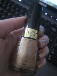
Quintessential Color: Copper Penny by Revlon


Okay well, I want to preface this to say that I am not sure how well this wears yet as I only just applied it. I got this bottle of gorgeous copper polish in a swap and I am already loving it as far as color goes. It's an amazing neutral which for me to say that means it's great. I'm not one to do neutrals on my nails. I chose a copper color because of all of my Steampunk stuff and this will go great. When it's darker in the room or low-light, the color doesn't pop as much but when you put it under direct sunlight, the orangey copper tones come through. It is definitely a true metallic which is another thing I love. :)

I will do a follow up soon with some observations on how it wears but until then, I wanted to share this wonderful color.

June 19, 2011

EOTD: Daddy's Little Precious


This is the look I decided to wear for Father's Day. I chose the name because of the metallic, glittery touches on the inside and outside corners and also because my father got me into The Lord of the Rings when I was 9 years old and it continues to be something the two of us bond over. I also wanted something at least a little natural looking so that my dad wouldn't looks at me weird. ;)

  • Too Faced Shadow Insurance
  • Sephora 5-in-1 Palette - Matte Mushroom Brown, Metallic Gold (not Antique Gold), and Metallic Copper
  • Make Up Forever Aqua Eyes Liner - Brown
  • MAC Longwear Mascara - Jet Black
I started off, as usual with Too Faced Shadow Insurance. Patting it on my eyelid, brow, and below my eye. Once this was blended and a ready, I put the mushroom brown color on the main part of my eyelid. I was careful not to go too far into the crease or outside of the main lid. I patted some copper on the inside corner. I wanted to make sure to build a good base of color here. The same with the gold on the outer lid. I took the gold below my lower lashes.

After this, I lined my lash line with a brown eyeliner (Make Up Forever in Brown) on the top and bottom and applied two layers of mascara on my top lashes.

A relatively simple but nice look. :D

Happy Father's Day to all of the fathers in the world.

June 14, 2011

FOTD: Simply Steampunk

Okay, so now, I thought I would move into creating some of my own looks. I'm still very new at this so please excuse the photos being at weird angles. I didn't have anyone to assist me in taking photos today.

This look is one that I wanted to create for both everyday as well as when I wear my Steampunk outfits. It's pretty simple and natural looking.

Items used:
Face:

  • Smashbox Foundation Primer
  • Laura Mercier Tinted Moisturizer SPF 20 - Nude
  • MAC Iridescent Powder
Eyes:

  • Laura Mercier Secret Concealer (used as a primer/base on the eyelids)
  • MAC Eyeshadow - Omega
  • Laura Mercier Eye Liner - Mahogany Brown (It's a potted brown powder liner)
  • Rockeresque Cosmetics - Loose Eyeshadow - Beating Heart
  • MAC Pro Longlash Mascara - Burnt Umber
Lips:

  • Laura Mercier Lipstick - Violet
  • Rockeresque Cosmetics - Beating Heart
Above is a photo of the completed look. I'm really pleased how this turned out since this was my first time putting a look together. It's very natural but also has a wow factor in certain light. My mom commented on how the copper of Beating Heart stood out when we were outdoors in broad daylight.

Now for the look I started off with Laura Mercier Tinted Moisturizer SPF 20. I use this because it doesn't go on too heavy but it definitely helps to even out my skintone for applying makeup. To finish off the foundation I lightly dusted it with MAC Iridescent Powder. A relatively simple start for an awesomely simple look.
For the eye, I started off by patting on some Laura Mercier Secret Concealer. I actually borrowed my mom's because since we're using it as a primer, it doesn't need to match your skintone exactly. Then, I patted on some MAC Eyeshadow in Omega. This goes all over the lid. Next, I take my detail brush and go into the crease with Rockeresque Cosmetics Loose Eyeshadow in Beating Heart. This color isn't due out until later this summer but I know that Rockeresque loves to send out samples of upcoming colors so you may luck out with your next order. ;) For the lashes, I put on two layers of MAC Pro Longlash mascara in Burnt Umber. I also went along the lashline with Laura Mercier Eye Liner in Mahogany Brown. I tried to keep the liner dramatic but still somewhat subtle.
For my lips, I put on a single layer of Laura Mercier Lipstick in Violet. I kept it nice and sheer but added some Beating Heart for some subtle shimmer.

And that's it for this look!